
4.6 percent of the world population is visually impaired
(4 percent has low vision and 0.6 percent has a substantial loss of vision in both eyes and is considered blind). This might not seem much when one just looks at the percentage but it is a group of over 285 million people (Fulton, 2016). This doesn’t even include the 7 to 12 percent of the population that experience some sort of color blindness (O’ Conner, 2014).
This means that over 285 million people will perceive an application, website or digital medium differently than one might expect. Perhaps they do not perceive the aesthetics as one had planned when designing a website or, worse, they can not find a button or contact-link on your homepage. Which renders the website unusable for the visually impaired user (VIP).
In the 21st century we do no longer just want to design for the masses. Accessibility has been a trend for a few years now and we see it everywhere around us. More and more minorities are included in our design processes and we think about the how and the why. This is why this brand book is created: to help (digital) designers with making their projects more accessible for the visually impaired people. It is our aim to do our part to make the world a little more accessible.

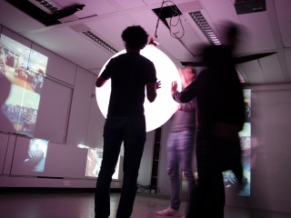
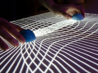
During the end of the first semester of the Master Digital Design-year, our client was Joey van der Bie, a researcher who’s working on a wayfinding app specificly focussed on visually impaired people. Finding your way around an unknown area can be a struggle even with all your senses working but it can be even harder when you’ve got some kind of visual impairment. The way we interact with our phones and computers is very screen-based, and not so much on the things you hear or even feel. Our goal within the project was to make a prototype of a phone & smartwatch app with visuals but also audible and tactile feedback. In the following video you can see how our wayfinding app, Watson, would work.
One thing that we noticed pretty soon in the research phase of our project was that there wasn’t a lot to find about how to design for visually impaired people. Most of the references that we found didn’t give much info or were simply outdated considering the digital era that we live in nowadays. That’s why we decided to not only build a prototype for an app, but also write a style guide for designers who want their designs to be more inclusive for the visually impaired.
On a much more meta-level we started writing chapters for all sorts of things- colors, typography, feedback and so on. We decided that a static pdf or even printed book would not deliver the message that we wanted to get across so we built a website around the information we found.
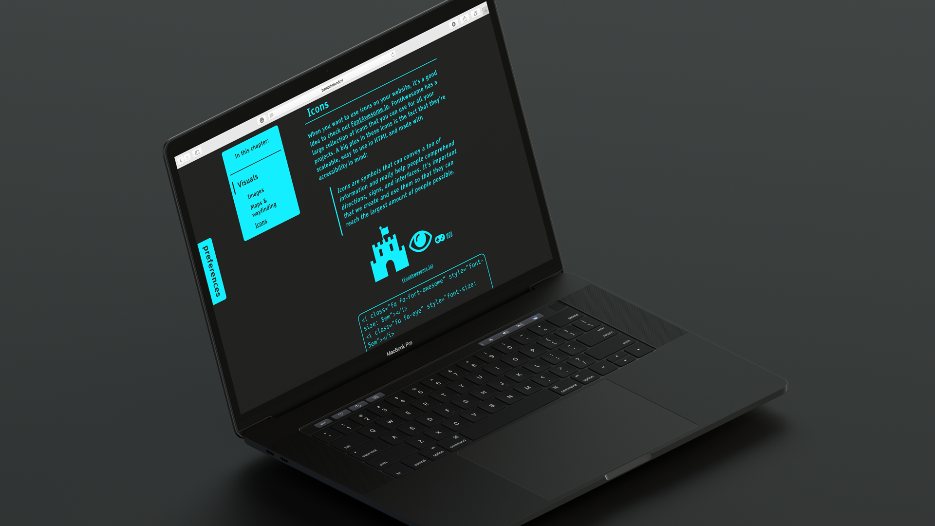
One of the important findings, which became even more clear when we were doing a user test with very helpful VIPs who wanted to test our app, was that no impairment is the same. This meant that we couldn’t come up with the perfect font size or perfect color scheme. Instead it needed to be as customizable as possible, and so we built this feature into the website as well. As you can see in the following screens, the user is able to change all sorts of preferences and even blur the page to give an example of what it could look like for someone with a visual impairment.
Title