The importance of good typography
Good typography on your website is very, very important. The best kind of typography is that when the reader doesn’t notice the typography, but the message. When you’re designing for VIPs, this is especially true. People with any kind of visual impairment don’t really care if your website or app has this amazing typography if it’s not readable enough. If you want to make your product readable for everyone, including people that are visually impaired, this chapter will help you make the most important choices considering typography.
Size
For those of us with good eyesight, it can come as a shock that a significant percentage of the population has trouble reading anything below 14 point Times on paper. Screens are less readable than paper, because of their lower resolution. (A list apart, 2000)
It’s important to know that the font size you give your text will look different on your device than on other devices. Personal settings and DPI of a specific device make a difference in how big your text will finally be shown on any screen. This means that it’s never entirely in the hands of the designer, but that’s not necessarily a bad thing. When you’re designing for digital media, remember that it’s OK to scroll. Using a smaller font size because the text fits better on your screen isn’t a good design decision. Like said before, this will be different on all sorts of different devices, and it’s not more expensive to use more space for your text (unlike in print), so use that space.
To realize how small the text is on many websites, compare to a book that you feel comfortable reading, then change the font size until the type on the book and the screen are about the same size: [img] It will look big if you hold the book right next to the screen, but it will look fine if you hold the book at a comfortable reading distance. Congratulations, you’ve probably ended up at about the browser default of 100%, if not larger. As long as you respect the reading distance, this works across devices too. (iA.net, 2006)
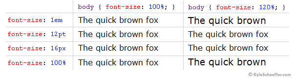
When you’re designing for web, using CSS, you have four different units you can use to define the size of your fonts: em, px, pt and %. Unless you have a very good reason to have your text in a fixed size, you can use px or pt. Otherwise, we would suggest using either em or %. Em and percent are pretty similar: both 1em and 100% are equal to the current font-size, meaning if you put another font-size in 2em or 200%, it will be twice as big. Now there’s not really a better or worse in the case of em vs. %, but if you’re designing for visually impaired you might want to consider using the percent. The reason for that is the following: if a user’s browser settings are set to larger text, the text on all webpages will automatically be bigger than how you’ve designed it. As you can see in the image below, smaller text using em is extremely small, and larger text is extremely large. The sizes that the percent gives are much more reasonable.
If you’re still not convinced, try reading a long article with 12px font—you probably won’t make it to the end. The use of small type stems from an age when computer screens were embarrassingly small, so it was necessary to show as much content as possible. No one was thinking about design or readability back then. (Kyle Schaeffer, 2008)
While you’re (re)considering the size of your text, it’s also a good idea to look at the amount of whitespace your design has. It’s important to let your text breathe.
Having space around the text reduces the stress level, as it’s much easier to focus. You don’t need to fill the whole window. White space looking nicer is a consequence of functional design. Who said websites need to be crammed with stuff? (iA.net, 2006)
This can be applied to the whitespace around the entire paragraphs but also around the words and characters. The right amount of characters per line is very important for the readability of the text: if the line is too wide (more than 80 characters) it will be hard to find the right beginning of the line when the users eyes travel from the right to the left side of the text. On the other side, when your lines are too narrow (less than 45 characters) it’ll stress the reader into starting a new line before finishing the current one, which might end up in the user missing important words. The 66-character line (counting both letters and spaces) is widely regarded as ideal (webtypography.net, 2005). If you want to calculate the perfect font size compared to your content width and CPL (characters per line), this calculator might come in handy.
One more thing you have to consider is the line height you give your text. The standard HTML line height is pretty cramped, so by simply increasing that to 140% you also increase the overall readability of your text. If you add the following line to your body you’ll immediately see that your text gets more space to breathe:
body {
                                line-height: 140%;}
Fonts
A rule you can always remember, when designing almost anything, is that almost 100% of the time you only need one, or two different fonts. One that you use for body text, and one that you use for things like titles, headings and menu items for example. If you feel the need to use more different kinds of fonts, reconsider increasing the contrast within the font with thickness, bold or italics.
(google.com), 2016
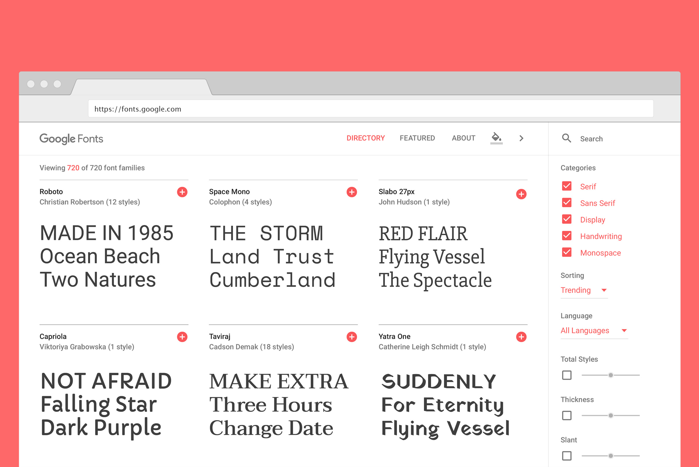
Google has collected over 800 fonts that are open source for both personal and commercial projects. In the Google Fonts catalog you can browse for the perfect font(s) for your project. When you’re designing for visually impaired people there are a couple things you can keep in mind when picking a font from this catalog. Firstly, you can uncheck the ‘Handwriting’ and ‘Display’ categories. These kinds of fonts are usually used if you want to give the reader a specific feeling when reading a text. This is generally a lot harder to read than regular fonts. That leaves three categories: ‘Serif’, ‘Sans serif’ and ‘Monospace’. The latter, we can un-check as well. The thing that monospaced typefaces have in common is that all characters have an equal width, which makes your text a lot wider than it has to be. For people that use a magnifier on their device, it’ll take a longer time to read a text that’s set in monospace because they can see less in the zoomed-in part of the text than they would when the text was set in another typeface.
(shyfonts.com), 2017
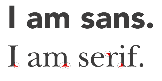
That leaves you with the choice between a sans- or serif font. The difference is easy to recognize: serif fonts have serifs, like Georgia and Times New Roman, and sans (literally meaning ‘without’) serif fonts have no serifs like Arial and Gill Sans.
In general, sans serif fonts are more legible for screens, and serif fonts more legible for print. The main reason for this is simple: Most computer screens have a DPI (dots per inch) around 100, up to 300 with Apple’s retina screens, where as print can go up to 1000 DPI. This means that a printed image or text can have much more detail than one you seen on a screen. Because of that lack of detail, sans serif fonts are best to read on a screen, especially when they’re relatively small.
Serifs are used to guide the horizontal “flow” of the eyes; The lack of serifs is said to contribute to a vertical stress in sans serifs, which is supposed to compete with the horizontal flow of reading (De Lange et al., 1993) When typefaces are digitised for use on computers, the letter forms have to fit within a relatively small pixel grid, often leading to what are called the “jaggies” (Rubinstein, 1988). Many web professionals such as graphic designers claim that this relatively low resolution cannot render effectively enough the fine finishing strokes of serif typefaces, and that sans serif typefaces lend themselves more naturally to being digitised, and come out cleaner and thus more legible. (Alex Poole, 2008)
Hierarchy
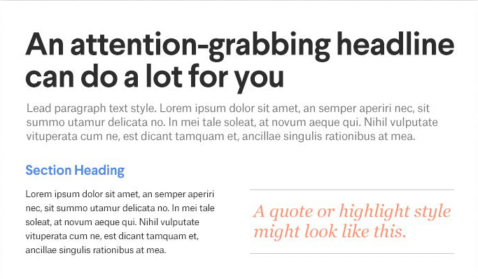
When you’re designing something, you usually have some kind of hierarchy when it comes to typography. Take a simple flyer for example: you decided on a size for your bodytext, a bigger size for your subtitles and the maintitle will probably be even bigger, maybe even bold. This contrast between different kinds of text, that have different levels of importancy, is very important when you’re designing for VIPs. Because websites and apps are interactive, you have to put extra thought in for example hyperlinks: how is the user gonna know that they can click on that word? Will it be in a different color than the rest of the text? Will it light up when they hover it with their mouse? A quick and easy way to set up your hierarchy settings is by making a mockup like the image below, where you can immediately see how the different blocks of type work together.
(99designs.nl), 2016
For an example page of almost all the possible elements on a HTML page, you can visit this website or you can test your own CSS sheet by downloading the following: HTML5 Testpage.
Good to know is that any kind of screen reader a VIP might use will follow the order of your headings, this means that the order of size should be from big to small (H1 to H2 and so on), because the screen reader will understand your hierarchy. If you’re not sure what sizes to give different kinds of elements, you can consult this scale that will also help you to make sure that the differences between elements scale properly to different kinds of devices. Typecast’s entire scale is open source and can be used immediately by copying and pasting this CSS sheet.
Do’s and don’ts when designing text
- Use no more than 2 different fonts within your project
- Don’t use all-caps. If you use all-caps, all words look like a rectangle, which makes it harder to tell apart different letters and words) (Jennifer Farley, 2010)
- Try to use italics as little as possible. They might boost reading performance, but they interfere with usability for VIPs (co.design, 2014 & UX StackExchange, 2014)
- For empathizing, use bold instead of italic (Buttericks practical typography, 2010-16)
- Never use
absolute!font sizes in your style sheets, give your designs the chance to live its own life on different screens and for different users - Try to stay around 66 characters per line (including spaces)