Testing your designs
O’ Conner, a web designer that has been working for 15 years in the field, describes that it is important to test early in the design process, so not just at the end of the process. She says that a designer should ‘take the time to see things differently’ (O’ Conner, 2014). Almost everyone that writes about designing with inclusivity in mind mentions that you have to test early and that you need to test it several times. This is already important when you design without having VIPs in mind but when you design for accessibility there is a big chance you can not test it yourself. Include testing in your design process so it doesn’t become an ‘afterthought’.
Helpful websites to check accessibility
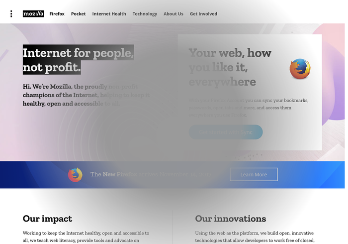
A good way to check if your design is accessible for the visually impaired is to use simulators. These simulators can help you to determine whether a design will work for a VIP. Using the simulator ‘NoCoffee’ a designer can see how their website looks for people with Cataracts, Macular degeneration or Diabetic retino pathy. You can read about and download NoCoffee here.

One of the better websites to check the accessibility of your website is wave.webaim.org. Here you can simply put the link to your website and see things like missing alternative texts for images and how your text is structured.
- dasplankton.de/ContrastA - to check color contrast
- webaim.org/resources/contrastchecker - to check color contrast
- juicystudio.com/services/luminositycontrastratio.php - to check color contrast
- pearsonified.com/typography - to check typography golden ratio
- wave.webaim.org/extension - a Chrome and Firefox extension to evaluate accessibility.
- developer.paciellogroup.com/resources/wat - an Internet Explorer extension to evaluate accessibility.
- etre.com/tools/colourblindsimulator - a color blindness simulator
VIP accessibility Checklist
To ensure that your project is accessible we have made a checklist for you to go through during the process of developing your project.
General
- Did you check your design with different devices and browsers?
- Did you check your design with different test users?
- Did you try to use the screenreader on your project?
- Is it clear for the user which parts of your design are clickable?
Text/Language
- Is the text resizable and/or made to be relative?
- Is the text to the point and doesn’t it have too many long sentences?
- Are the hyperlinks descriptive?
- Are headings used in the right way?
- Did you create a clear hierarchy in typography?
- Did you alter the line height and text spacing?
Colors
- Are the contrasts high enough (or is there another color option available)?
- Are buttons and functions not only differentiated by color but also by text?
- Has the project been tested by using a color blindness simulator?
An alternative checklist can be found at the website of The A11Y Project.
You can use the persona’s found in the ‘target audience’ chapter to see if your design works for one or more of these. This way you can check whether your project caters to one or more visual impairment. This is just a preliminary check though, testing with actual VIPs is always recommended.