Using colors in your designs
Colors (or the absence thereof) are an important part of any design. However when one designs with the visually impaired in mind options can seem limited. Testing is a very important step within the process also for the colors, because you're not just designing for users that may have trouble seeing, but also users that may be colorblind.
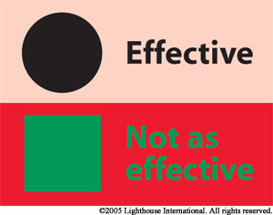
Do not rely solely on color
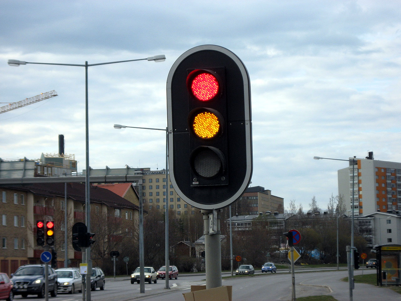
Imagine you stand still in front of a traffic light, the red light signals you that you have to wait until you can cross the road. While people that are not visually impaired might not realize this, the traffic lights usually do not only rely on color but also on the location of the light (first, second or third place) and sometimes an icon that tells the user what they are supposed to do.
This same principle should be implemented on digital designs, instead of a green and a red button with no text or iconography there should be an icon or text that indicates the function of the button next to the color indication. This was also implemented on banknotes, where they added identification marks next to the numeric values and color indicators (Heij, 2009b).
Colors and contrast
One of the most important factors in readability is contrast. While an ideal situation would be that websites and applications offer different ‘themes’ or customization so everyone can make the website or application perfect for their needs this is not always a valid option. Therefor we will look at the ideal color combinations for the visually impaired and what works for them and what doesn’t work.
VIPs prefer a dark background with a pale text. While a lot of sources might recommend white on a black background, we find through talking with VIPs that this is not the case. This is also confirmed by a Canadian research on the accessibility of Bank Notes for the visually impaired (Heij, 2009a). There seems to be a stronger preference for a dark grey or black background with a bright color to contrast it instead of the usual black on white.
In the end the color needs to combined with a clear and logical design, you will need to test it with a simulator or preferably with the target audience to confirm whether the design is working for them.
The importance of color
De Heij speaks about the importance of a color in the Banknote design for the visually impaired rapport. Here he underlines the importance of avoiding shade differences (for example light and medium blue hues) and recommend different vivid colors to differentiate between different Banknotes (so, differentiate between different functions or meanings). People that were unable to see the difference between subtle color differences would get confused by blue and a more saturated blue (Heij, 2009a).
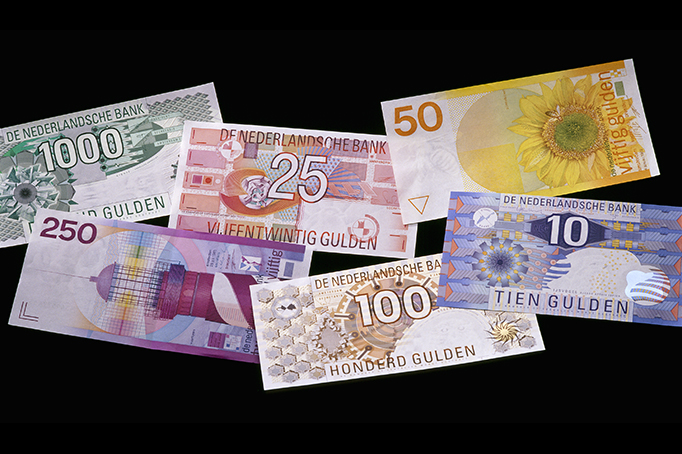
(Example of the Dutch Guldens)